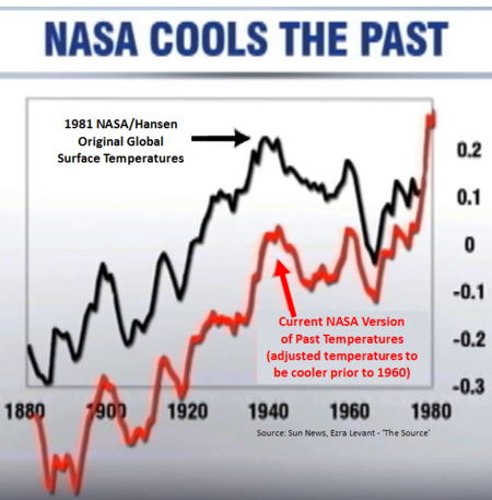
 In a recent discussion on the NRC site somebody mentioned a temperature chart that “proved” that NASA / Hansen were fabricating data. It refered to this post that has the chart here to the right. I do know that historic data sometimes has been adjusted, all of it for very good reasons, but 0.2 degree Celsius over a long period is unheard of. Can this be true? I compared the 1981 data with today’s data. The 1981 original article is easily found here on the site of NASA/GISS. Hansen e.a. stated in the abstract that
the global temperature rose 0.2°C between the middle 1960s and 1980, yielding a warming of 0.4°C in the past century.
That is of course the case both in the red – and the black lines in the diagram, so that raises the questions:
- what causes the ±0.2 C difference between the red line and the black line?
- why is the steep rise in the red line near 1980 not in the original black line?
The black line comes from the original article, figure 3. I have reproduced it here. 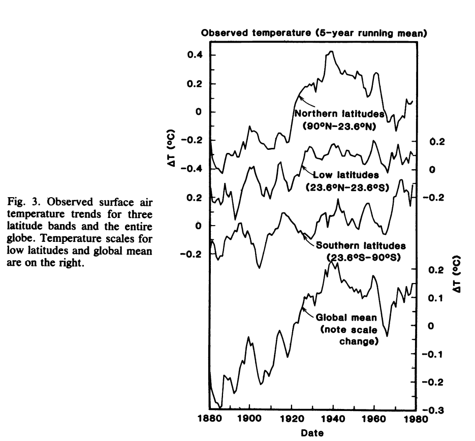 So the black line is a five year (running) average on a temperature anomaly, the anomaly from the 1880-1980 mean. At the time of writing this article Hansen e.a. did not have any data prior to 1880, so they must have extended the running means to the edges of the chart. Anyway, that is not a big deal. I also took the present day GISS database, normalized it so that the mean of the 1880-1980 period is zero and drew a similar graph with part of this figure 3 as background. So this is how their chart should have been made:
 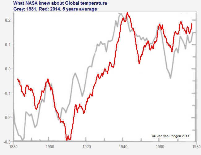 The red line is the current data from GISS. We see that the minima, maxima and average are still all the same, even though the data itself is different in some areas. The 1940 maximum is exactly the same height, even though it moved a little to the right. So the red line in the figure of the SUN News used the wrong baseline. That is “mistake” number one. The steep rise in the red line comes from using the 1980 to mid 1982 temperatures in the running average, values that Hansen e.a. of course could not be aware of. That is “mistake” number 2. I doubt whether these mistakes were really mistakes. In the Sun News chart, the 1978-1980 black line has been hidden behind the red line. It should have remained visible to the right of the red line. So it has been removed, suggesting that it hides behind the red – and that it is the same point in 1980. The person making this chart must have done this on purpose. R code for the last plot
require(zoo) # for rollmean
require(jpeg) # for readJPEG
source("JBvRlibrary.R") # for read.gss, pretty.plot, ts.to.df

trial<-read.gss(new=TRUE) # reads current Giss database
m = mean(window(trial, start=1880, end=1979.999))
trial<-trial-m
tr2<-rollmean(window(trial, start=1880, end=1980), k=60, align="center")

pretty.plot(ts.to.df(tr2), xlim=c(1880,1980)
 , main="What NASA knew about Global Temperature\nGrey: 1981, Red: 2014. 5 years average") # just draw the box
img <- readJPEG("bg.jpg") # Hansen old plot as background
rasterImage(img, 1880, -0.3, 1980, 0.23)
pretty.plot(ts.to.df(tr2),
 add=TRUE, kleur=1, lwd=3
 )
mtext("CC Jan van Rongen 2014"
 , side=1, line=-1.6, adj=0.95, cex=0.65)